
Typeface Development
Style Variation Design
Font Weight Calibration
Texture preservation
Humanize digital typography
Preserve handwriting character
Enable personal expression
Challenge typographic standards
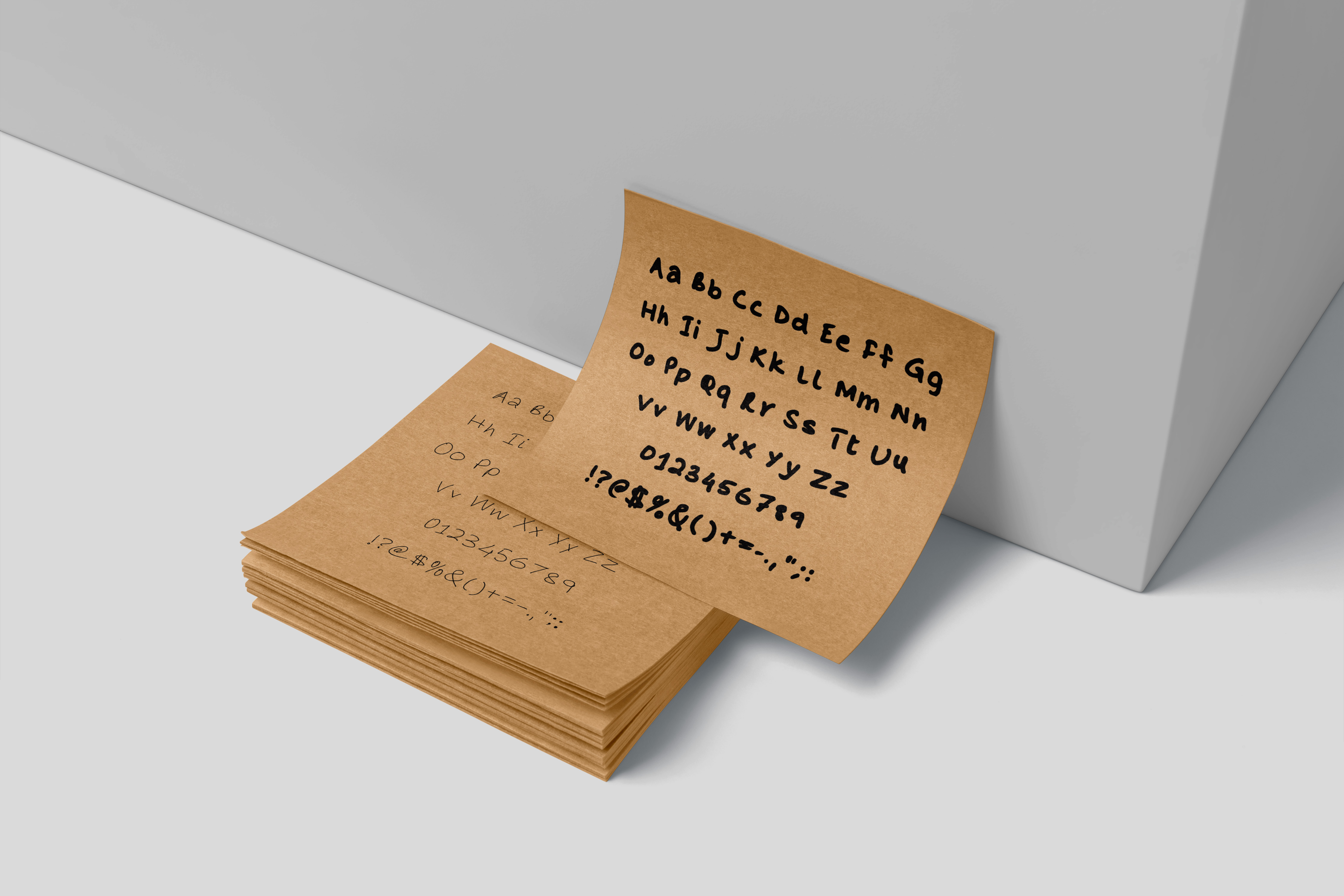
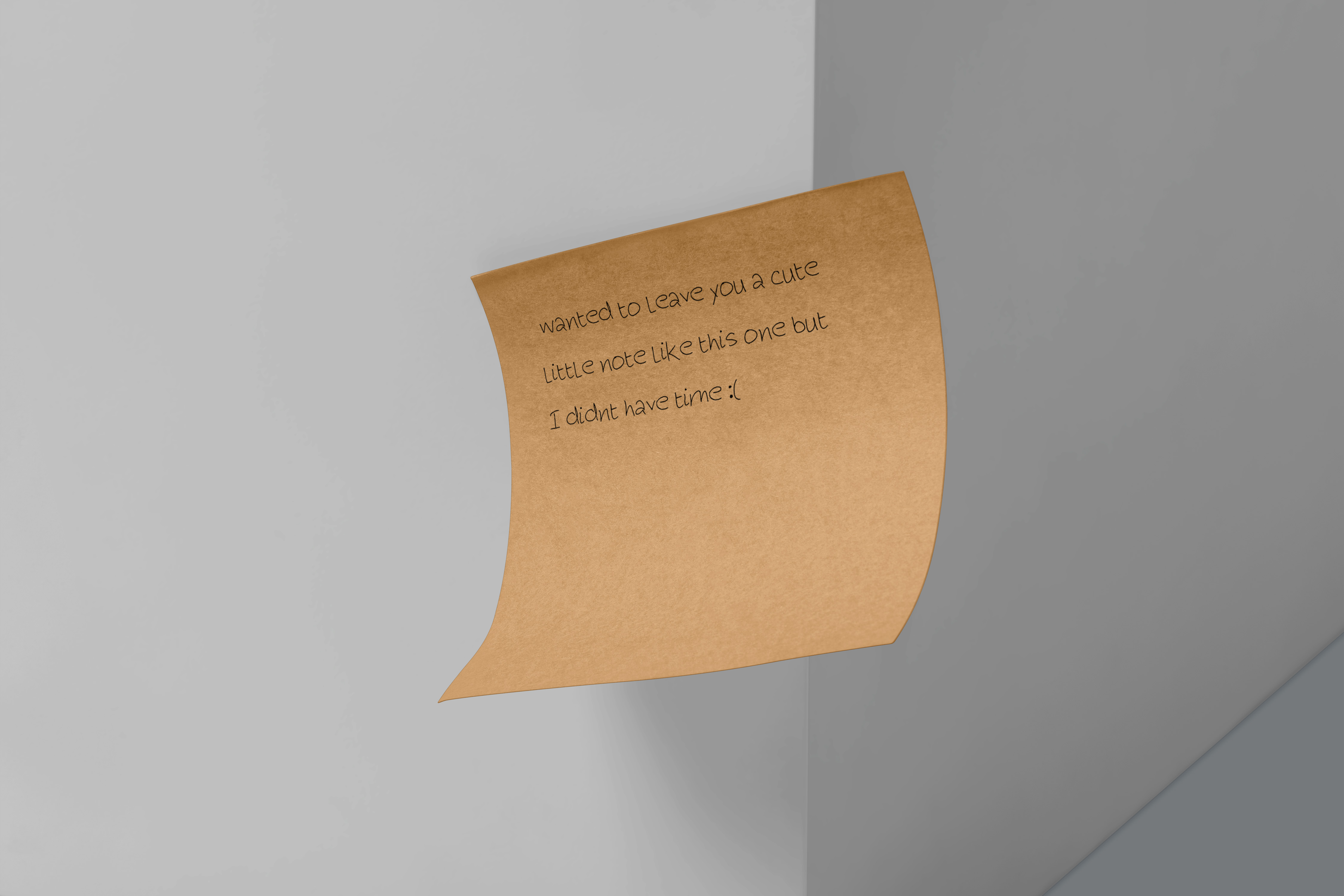
Handwritten notes carry a unique visual rhythm and character, a form of personal expression that often disappears in digital environments. This project explores how that emotional quality can be translated into a functional, scalable typeface system. By capturing the texture and flow of natural handwriting, the collection aims to humanize screen-based communication and create a bridge between the individuality of analog writing and the uniformity of digital typography. The challenge was twofold: first, to faithfully reproduce the nuances of handwriting; its irregularities, pressures, and textures, within the constraints of a digital font; and second, to question the role of handwriting-based typefaces in an era of mass personalization. While variable fonts and algorithmic type systems dominate modern typography, this project asks whether individuality can be reintroduced by starting with something as personal as one’s own script.
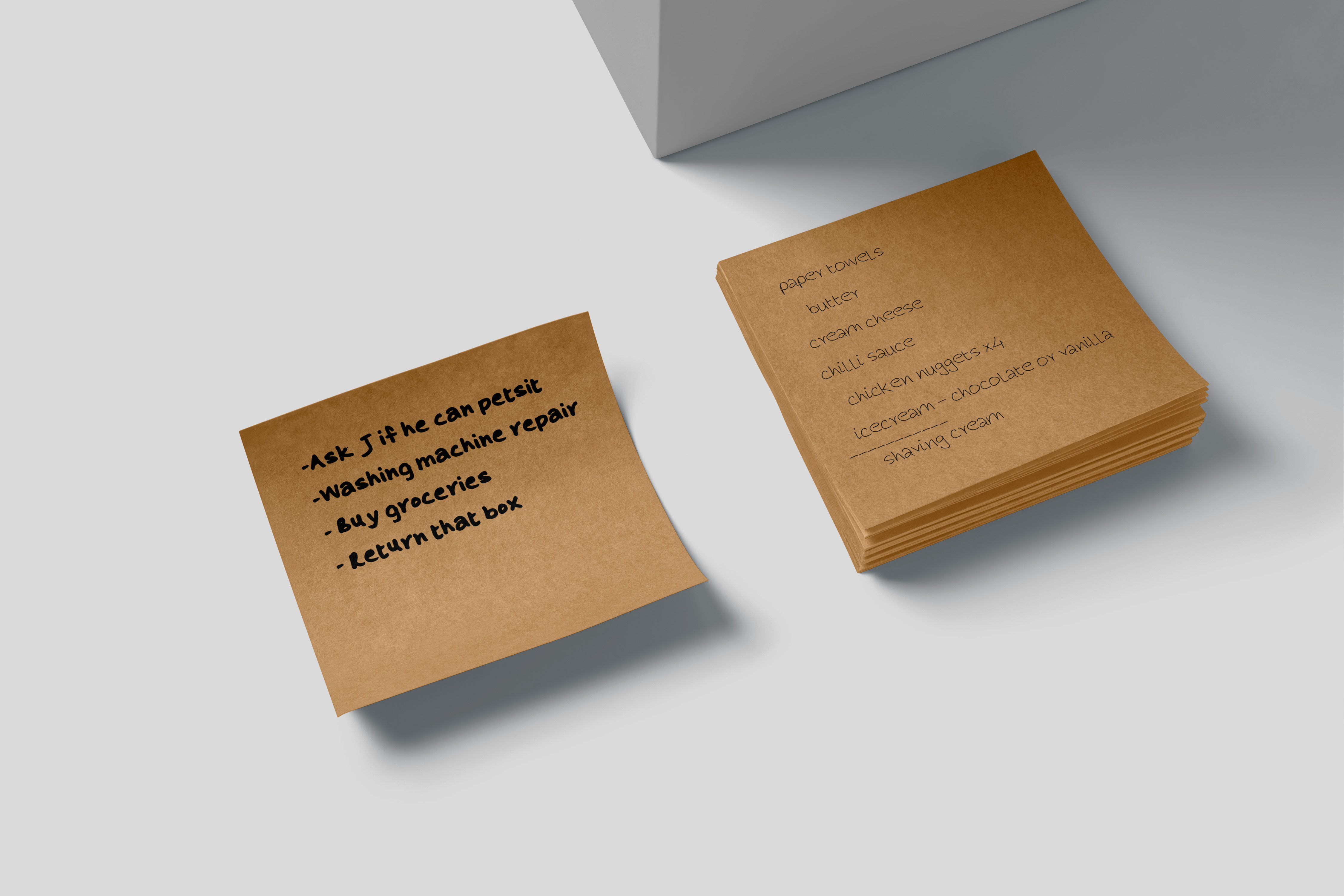
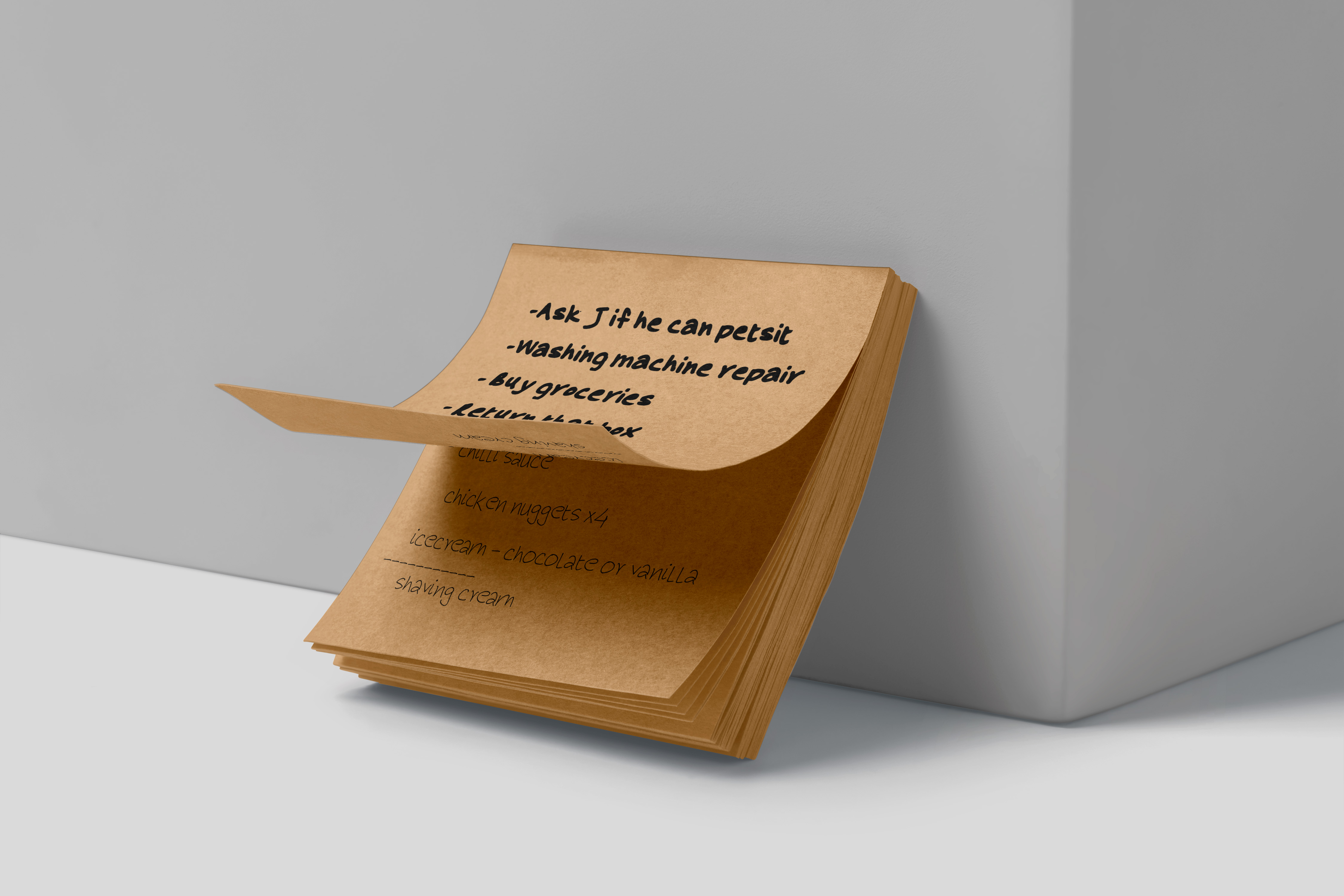
The approach was grounded in a material-first methodology. Four common writing instruments—felt-tip marker, gel pen, ballpoint pen, and pencil—were selected for their distinct stroke qualities. Each style was written by hand, scanned at high resolution, and digitized into vector outlines. Texture preservation was critical. The marker style captures fluid rounded strokes, the gel pen emphasizes sharp contrast and precision, the ballpoint pen preserves everyday pressure variations, and the pencil style renders a grainy, layered aesthetic. To maintain the natural character of handwriting, intentional irregularities were introduced into kerning, x-heights, and baselines rather than smoothing them out. Each typeface was calibrated to display optimally at 14pt on high-definition screens, balancing fidelity to the medium with readability. Testing across multiple applications confirmed that while the fonts display best on modern displays, they are not suited to low-resolution or e‑ink environments, where the subtleties of stroke detail are lost.
The final collection consists of four display fonts, each rooted in the expressive qualities of its writing tool. These typefaces intentionally resist typographic neutrality. By reintroducing texture and imperfection into digital type, the project reframes handwriting as a legitimate design asset rather than a nostalgic artifact. Beyond the aesthetic output, the project raises a broader question about typographic personalization: how can fonts be a reflection of individual identity in a landscape dominated by standardization? Making these fonts freely available invites designers and creators to experiment with integrating warmth and personality into digital content—challenging the sterile, homogenous nature of much contemporary typography. This work underscores that even in high‑resolution digital environments, imperfection remains a powerful form of character. It suggests a pathway for future font design, one where the personal and expressive qualities of handwriting can coexist with the scalability and utility of modern type systems.

